
Discover how colors influence mood and space, and learn how to use tones thoughtfully to create calm, balanced, and timeless interiors.
Color is one of the most powerful tools in interior design. It shapes how a space feels, influences mood, and defines the overall atmosphere of your home. By understanding how different shades work, you can create interiors that feel calm, balanced, and intentional.
Color Theory Basics
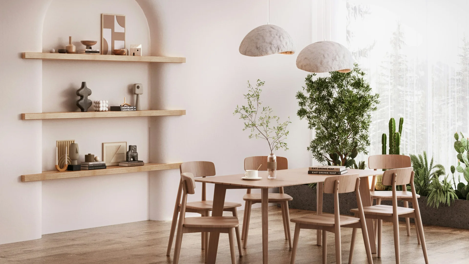
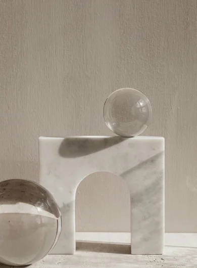
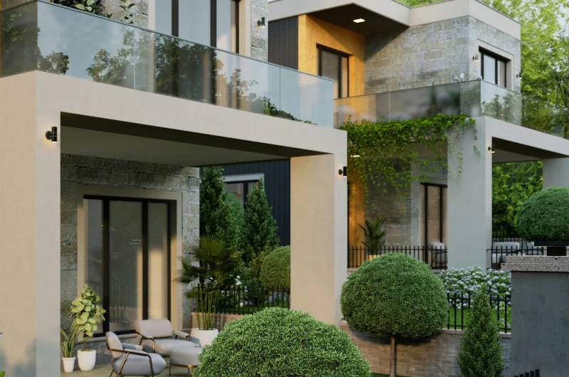
A well-designed space begins with a clear understanding of color relationships. Choosing a consistent palette helps create harmony, while limiting excess colors keeps the space feeling clean and refined.
Creating Calm
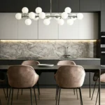
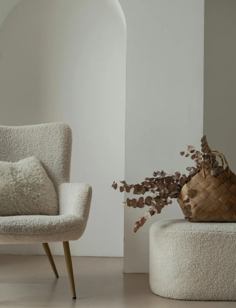
Soft neutrals and muted tones bring a sense of calm and clarity to a space. These shades allow the environment to feel open, relaxed, and easy to live in—making them ideal for everyday interiors.
Understanding the Emotional Impact of Colors
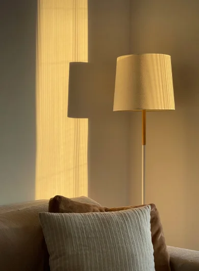
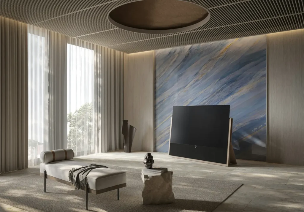
Colors influence how we feel within a space. While warmer tones create comfort and energy, cooler shades bring relaxation and focus. Choosing the right balance helps shape the overall experience of your home.
Using Cool Tones to Foster Relaxation
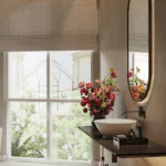
Blues, greens, and soft greys are known for their calming effect. These colors work well in bedrooms and quiet areas, helping to create a peaceful and restful environment.
Energizing Spaces
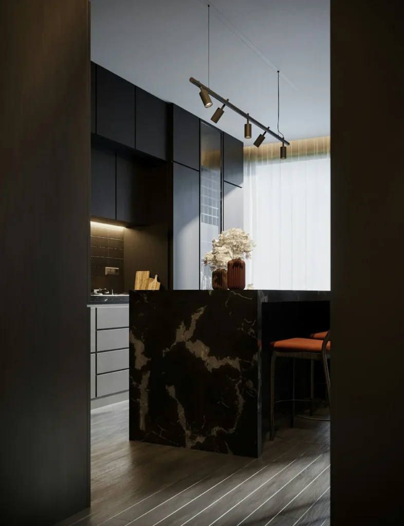
Brighter tones, when used in moderation, can bring a sense of life and energy into a space without disrupting its overall balance. Subtle accents in soft yellows, muted oranges, or warm undertones can uplift the environment, making it feel more dynamic and welcoming. These colors work best when introduced through smaller elements such as cushions, artwork, décor pieces, or a single statement wall—allowing them to stand out without overpowering the entire design.
When thoughtfully integrated, these energizing hues create a contrast against neutral or calm backgrounds, adding depth and visual interest. The key lies in restraint—using just enough color to enhance the mood while maintaining a clean and cohesive look. This approach ensures that the space feels lively yet refined, striking the right balance between vibrancy and sophistication for everyday living.
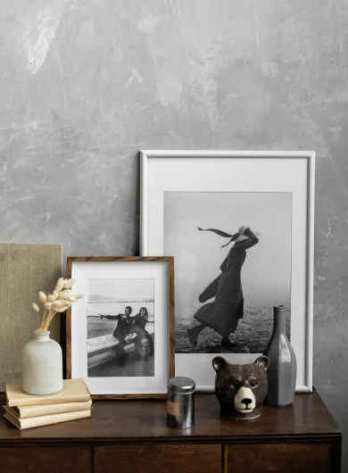
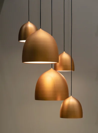
Incorporating Warm Colors for a Vibrant Feel
Warm tones like terracotta, beige, and soft browns add depth and warmth. When balanced with neutral elements, they create interiors that feel inviting and grounded.
Be the first to read my stories
Designing a conscious home? Let’s create it together →

Comments
miaqueen
It’s a great pleasure reading your post!
cmsmasters
Thanks.